Let’s begin with a bit of background. In order to realise an investment opportunity, traders must first acquire a position. They can do this by buying or selling shares of stock in the ‘market’. While this sounds quite simple and maybe obvious, the term ‘market’ hides a lot of complexity. The reason is that the ‘market’ consists of many places to trade. While many years ago, there was typically only a single place to trade (often called an exchange), we now have many places to trade, some with names like MTFs, ATSs or ECNs. This means that we need to make choices about which of these venues to interact with when we go to purchase shares of stock. We also need to consider the ways in which we interact with the collection of trading venues we refer to as
the ‘market’.
While there are many possible questions to address, three key questions we would like to answer regarding our order are: When did we execute? Where did we execute? and how did we execute?
The portfolio manager generally knows why they want to execute, but the other three questions all relate to how the order was managed by a broker. The brokers use technologies such as algos that determine timing, and routers that determine where to direct the order and the way to execute.
One of the key things being managed in this approach is market impact. When we go to the market, we don’t want to move the market too much as that can only hurt our performance. At the same time, the role of the market is to provide price discovery – the process of finding equilibrium prices that balance supply and demand. Therefore, we want to develop tools that can allow us to determine the answers to the questions of where, when and how we should trade so we can understand why we got the outcome we did.
Ultimately, what we want to be able to do is to see the big picture of how our order interacted with the market. It therefore seems natural to visualise this interaction in a picture. We can develop such a picture by plotting the way we interacted along three dimensions.
The first dimension we care about is time – we want to answer the question ‘when did we trade?’ We want to be able to show how much volume we traded as a function of time. The second dimension we care about is the trading venue – we want to answer the question ‘where did we trade?’ The third dimension we care about is the way we interacted with the market – did we cross the spread and remove liquidity? did we post our order passively in the book providing liquidity? or did we execute in a dark pool? – we want to answer the question ‘how did we trade?’
Unfortunately, pictures are two dimensional, so how can we show these three dimensions in a single picture? Well, fortunately, there are colour pictures! So maybe we can answer all three questions by developing a colour image. We can show a time dimension along the horizontal dimension of our picture, and a venue dimension along the vertical dimension of our picture and then the colour can indicate how we traded.
We use the property that any colour is a mixture of red, green and blue. So, if we use red to represent the ‘active’ volume from crossing the spread, blue to represent the ‘passive’ volume and green to represent dark volume, then we can combine three ways of interacting with a venue into a colour which is itself a mixture of active, passive and dark volume. The intensity of the colour is proportional to the amount of volume while the actual colour is determined by the distribution of active/passive/dark. When the pixel is red, it means the volume in that bucket was all active. If the pixel is blue, the volume was all passive, while if green, then the volume was all dark. Other colours are mixtures of these three ‘primary’ colours.
This has real-life applications in evaluating the order routing of different brokers and can be used as an input into making algo wheel strategies. Analysing execution data in this way allows us to clearly see the differences in order routing between brokers both under similar and different trading conditions. How differently do different algos trade? How similar are different brokers’ algos? How does my trading strategy influence my realised market impact?

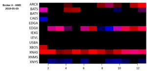
Figure 1: Broker A, Symbol = AMD, Date = 2019-05-03

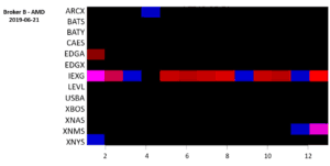
Figure 2: Broker B, Symbol = AMD, Date = 2019-05-03
Consider the differences between the routing in Figures 1 and 2 above.
These two images both show a single order in AMD done within six weeks of each other. The x-axis represents the time of day, and in this example shows 30-minute time buckets between the open and close of the market (9:30 – 16:00). Each row shows a different trading venue. The colour shows the way the order was traded by combing active, passive and dark fraction of volume as an RGB triplet, while the brightness represents the fraction of the overall order done at the given time on the given venue.
We can see that Broker A mixes both aggressive and passive executions across multiple venues while Broker B largely executes on a single venue throughout most of the trading day. This technique can easily be used across an aggregate of thousands of orders to identify the broker’s order routing tendencies.

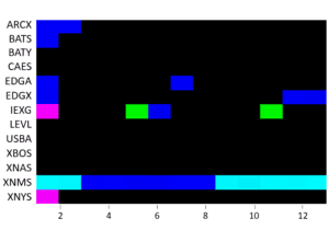
Figure 3: Broker B – Low Volatility

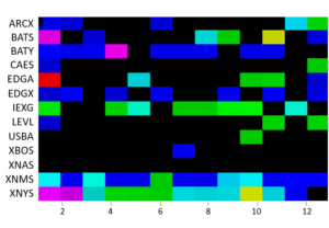
Figure 4: Broker B – High Volatility
In Figure 3 (low volatility), Broker B relies heavily on a single trading venue and is largely passive in execution style. However, Figure 4 shows that in a high volatility environment, order routing switches to using many venues and becomes somewhat more aggressive.
The use of colour allows us to clearly see differences in venue selection, timing and the degree of active versus passive trading. More importantly, the colours, brightness and size of each box can be converted into numerical equivalents which allow us to quantify the differences for best execution and specific applications, such as Algo Wheel selection.
